Yesterday the British online supermarket delivery company Ocado unveiled the CargoPod, its first foray into driverless deliveries.
It’s certainly a cool and forward-thinking concept that’s only slightly undermined by the fact that the system currently requires an emergency driver to be present in the vehicle at all times.
In fact, most of the images we’ve seen of the van appear to show it being manned by two people which by our estimation is two times the number that current non-driverless deliveries currently require.
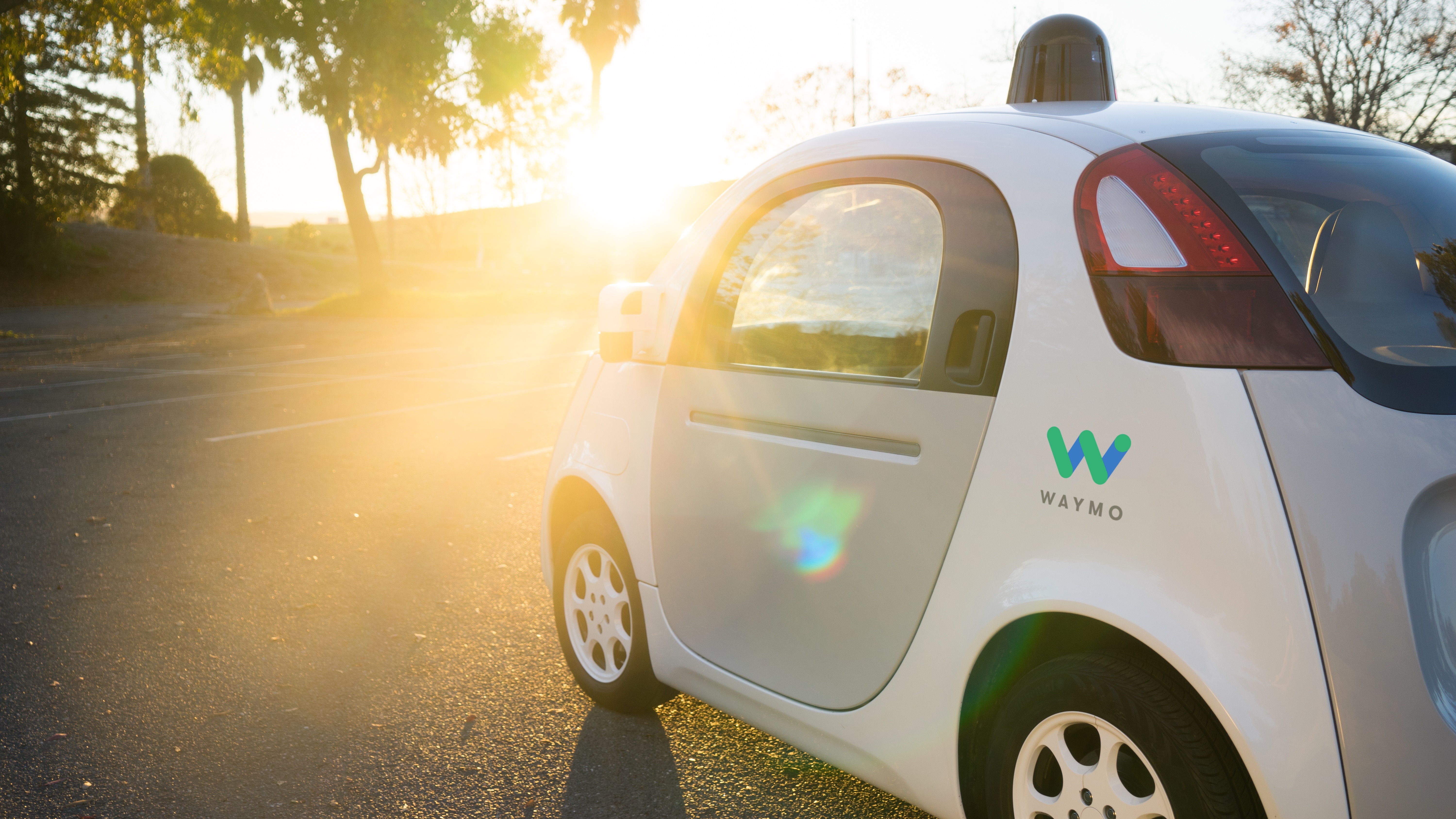
But what struck us most about the CargoPod was just how horrifically dorky it looks. Engadget reckons it looks like a 1960s milk float. We think it looks like what would happen if you left a dice and a tuk tuk in a room together with a copy of Fifty Shades of Gray.
We had a similar reaction when Waymo unveiled its first custom made driverless car. Previously the Google-owned company had been retrofitting its technology into existing vehicles, but clearly someone at the company thought the results didn’t look bloody stupid enough so instead we got this monstrosity.

To be fair Tesla has continued to make brilliant looking cars despite its rapidly progressing driverless efforts, but maybe the requirement to make your vehicles look like Fisher Price knockoffs doesn’t kick in until you hit a certain level of autonomy.
I appreciate that designing futuristic looking devices can’t be easy. You have to toe that difficult line between designing something that’s easily recognizable as what it ultimately is, while still giving it enough visual flair to allow it to stand out. Driverless cars are especially difficult thanks to their presumably stringent safety requirements.
But maybe there’s something more at play. Maybe these vehicles look like this intentionally, out of some desire to make them appear less threatening to a world that’s still in love with its vehicles.
A calculated PR move
After all, we’ve already explored the impact on jobs that driverless vehicles are likely to have, and it wouldn’t be surprising if a backlash against the technology starts to develop as this becomes increasingly clear.
So perhaps there’s a value in making these first few driverless vehicles, which are likely to become the movement’s poster children, as childlike and inoffensive as possible.
These vehicles look like handy tools more similar in appearance to a nifty kitchen gadget than an autonomous vehicle packing half a tonne of batteries alone.
The appearance of these cars looks like a sign of the PR-battle that’s to come as employees and unions slowly wake up to the realization of the disruption these vehicles are going to tow in their wake.
And then it will be a simple matter of someone from Waymo pointing to a photo of its driverless vehicle and saying, “What? This little guy? Stealing your jobs? How could he possibly, I mean look how cute he is!”
So yes, these current driverless efforts look a little stupid, comical even. But maybe this is all part of the strategy to win over society’s hearts and minds to their cause.
This is a new dawn of a new era that not everyone will want, and these vehicles are a sign of the charm offensive that’s to come.
- Jon Porter is TechRadar’s driverless and electric car obsessive. Every week his column, The Transporter, discusses the biggest developments in the area, and its implications for the future of transport.
- Check out the previous entries in the column:
- 'Why non-driverless electric cars will never take off'
- 'In a world of driverless cars the racetrack will be a driver's oasis'
- 'Driverless cars and an automated future are a big problem for unskilled youth'
from TechRadar - All the latest technology news http://www.techradar.com/news/from-waymo-to-cargopod-why-are-driverless-cars-so-damn-ugly
No comments:
Post a Comment